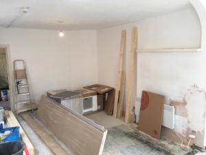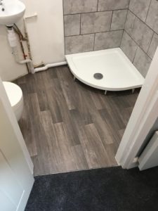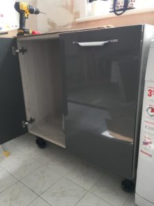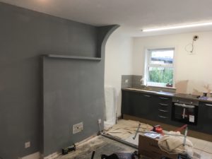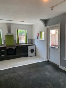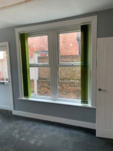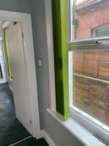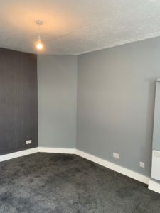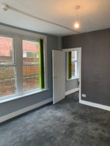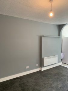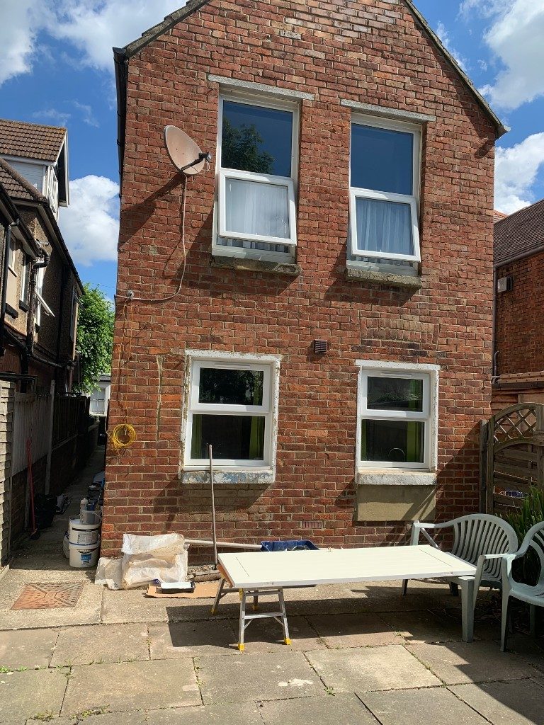
The subject of this week’s blog is a closer look at a refurbishment. It’s not a full case study but more a look at the kind of transformation that can be achieved with even the most dire property and the colour schemes and suppliers we are currently using for different components and materials. So if you are currently refurbishing a studio apartment you may find this of interest.
The Property
The property in question was acquired a couple of years ago as part of a freehold which included an established 7 bed HMO. It is fully self contained, occupies 29SqM and is on the ground floor at the rear of the property and includes a south facing garden. When we bought the property the studio had a longstanding tenant. However, we immediately recognised the need to improve the property when the opportunity arose and initially considered the idea of extending to the rear to potentially extend and convert the property into a 1 bed or even two bed flat. This scheme was eventually discounted as it didn’t stack financially and we decided just to proceed with a refurbishment which in itself would improve the rental potential considerably.
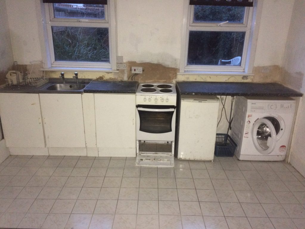
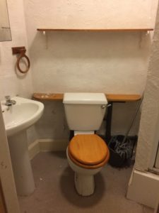
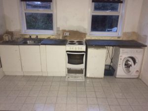
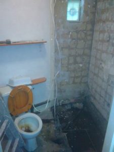
We already knew the property was in poor condition and suffering from damp and condensation issues but it had not been possible to rectify these issues adequately with the tenant in situ. The kitchen in particular was very poor as was the shower room which had a less than ideal layout. Upon closer inspection after full strip out, several sections of the flooring were found to have rotted away and had to be replaced, with proper ventilation and insulation being installed at the same time.
The Finished Product.
For the finished product we wanted to use contemporary colours and make the best use of the space available to give the apartment a modern feel whilst rectifying the basic failings of lack of insulation, ventilation and poor quality fixtures and fixings.
We used a dark green gloss kitchen from Howdens with wood effect carcasses which gave a feeling of slightly higher quality than plain white. Accents were in lime green – picked out in the vertical blinds and glass splashback.
The wall finishings were in manhatten grey from Johnstones, mainly chosen because we could get very discounted paint locally and the quality is pretty good. We applied a modern wallpaper to a feature wall.
Carpeting is silver grey from a local flooring supplier, again chosen because we have used them on several projects in the past and this particular carpet was heavily discounted (we have used it on a few recent projects).
The showerroom was fitted out with a suite from bathrooms.com via our LNPG account.
So, we hope you have been inspired by these photos about refurbishing a studio apartment and can see what you can do with a comparatively small space. We will from time to time write about our refurbishments and development projects so keep a look out for these posts or visit our developing page. As always if you have any questions then get in touch.
FREE 'Common Property Investing Mistakes' guide.

We have created a free guide to help you get going on your property investment journey. This invaluable guide includes the most common property investing mistakes. The guide is completely FREE and you can claim your free guide by clicking here.


